|
New site? Maybe some day. 
| Informational and Related Links | |
| Bands:
Goreality |

|
|
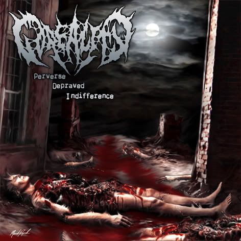
wow. Who the hell made that album cover? It's sick as fuck! |
|
|
Mark Rawls from GUTTURAL ENGORGEMENT, SIKFUK and KRETAN.
|
|
|
Apparently that guy doesn't fuck around. For a moment I almost thought it said Mark Richards at the bottom. That's why I asked. |
|
|
I thought Mark Richards said he was doing this art, weird
sick regardless |
|
|
I believe that was the plan, not sure.
|
|
|
Yeah, I really hope that's not the final cover artwork. It kinda looks like the cover to a shitty video game. |
|
|
it's got a resident evil feel to it...but i think its killer...i just want the damn cd already!!!!! |
|
|
the logo will be a differant, same font though. |
|
|
The art is done, it's the other stuff that will change, sorry Richie boy. |
|
|
I will buy the CD, but I will have deep feelings of resentment. |
|
|
fishcakes said: | the logo will be a differant, same font though. |
theres going to be a new logo? |
|
|
yeah, i was going to do the artwork, but the past few months have sucked and i fell out of the loop, so therefore i suck, haha. i actually thought that said mark riddick down the bottom, which would have been weird, haha. i'll be looking forward to seeing how the art tightens up. if he did the cover to the vermicular decay cd, then i'm sure it will come out pretty damn tight. |
|
|
if you say that the goreality cover is already done, then he is NOT done. those blatant photoshop blur marks need to be fixed ASAP, otherwise it's going to look like he just took an already existing piece of artwork and stretched a few parts out. just saying, as an artist, that looks very unprofessional.
oh, and i meant to say the guttural engorgement cd; the vermicular decay cover is well executed, but the guttural engorgement cover is fucking nasty as all hell. |
|
|
Sho did the GE cover, not Mark.
Are you talking about the little maggot thingies?
|
|
|
i figured it was sho. he is a robot.
i don't really see any maggot thingies, but the little things popping off the guy's head that look like blurry horns and all the other marks like that look like shit. after seeing what he can do, that stuff shouldn't be there. some of the blood looks like it needs a little bit more definition and value as well. |
|
|
yay! i <3 goreality. and vermicular decay. this thread is thumbs up. |
|
|
the logo will look different and the words will be along the bottom. and I will rub one out to it. thanx |
|
|
can't wait to hear the new stuff. |
|
|
i'll be afraid to put this in my stereo, it will probably come alive and rape me with a barbed wire bat, and tear my skin off. then put it back on. skin on, skin off. |
|
|
Definitely looks like I'm playing playstation. |
|
|
I can't wait until this is out! |
|
|
fishcakes said: | the words will be along the bottom. |
There's already so much going on at the bottom with the guts and gore, the title looks better up there. |
|
|
yeah, ive been waiting for this ever since FUF played with Goreality at the bullpen. its gonna be the balls.
as for it looking like a video game, GOOD.
resident evil = AWESOMES
god of war = AWESOMES
dead rising = AWESOMES
gorealty = AWESOMES x 9 |
|
|
oops, i meant goreality, not gorealty. who offer death metal mortgages. 5.9% fixed APR with live-in guard dog Will Rahmer*
*offer not available in poland |
|
|
Goreality kicks maximum ass |
|
|
LOOKING FOWARD TO THIS!!!! |
|
|
AUTOPSY_666 said: fishcakes said:| the words will be along the bottom. |
There's already so much going on at the bottom with the guts and gore, the title looks better up there. |
NO!  |
|
|
I think it would look better with the title down at the bottom too. But that's just my two cents. |
|
|
I like that cover. It's not too crowded. Just a simple idea and by the looks of it, the cover will reflect the music. |
|
|
i'm tellin ya, those smudge lines take away from the quality of that piece. if those were fixed, that would perfect the piece.
and i also agree that the title would look good down the bottom, maybe with a dropped shadow to make it pop from the background. right now, the balance is off. the key to good art/design is composition. the illustration itself is well balanced, but the placement of the logo and title cause the weight of the piece to shift in an awkward manner. if i was the graphic designer in this situation, i would put the title centered, about 1/4"-1/2" from the bottom. i would also shrink the logo just a bit and either keep it in the same general region, or center it perfectly. like mike said, just my 2 cents...but i spent a shitload more than 2 cents on a fucking degree in this shit, heh heh heh. |
|
|
Send me the image, and the logo and I will make some scratch idea's for you. I never have anything to do, and maybe I can spawn some idea's. They will be rough, and need to be done for your graphic artist, but I can jam in some idea's |
|
|
I think the tittle needs to be on the bottom and the logo can be a little smaller. god dammit! |
|
|
The logo is the same size as the split CD, it's just that the cover isn't actual size here.
|
|
|
needs more bodies piled up.
symmetrical stacks of corpsessssssssssssssssss! |
|
|
i think those smudge lines are like a watermark, because i saw it before and it definitely didnt have them. |
|
|
i kind of thought that at first, but i didn't see any sort of watermarks on his other work so i tossed that idea out. if it is a watermark, thank fucking christ, haha. |
|
|
are you talking about the shit on the arm?
|
|
|
fishcakes said: are you talking about the shit on the arm?
|
yeah, and the things that look like horns on his head |
|
|
Joshtruction said: | Send me the image, and the logo and I will make some scratch idea's for you. I never have anything to do, and maybe I can spawn some idea's. They will be rough, and need to be done for your graphic artist, but I can jam in some idea's |
has dwyer sent it to you josh? |
|
|
Why would I send it to anybody?
I can handle it. |
|
|
the idea is good, but the video game image is lame and so are the oversized maggots.
Anoxia and Teratism now they knew how to pick an album cover.
goodluck Fish |
|
|
You can barely see the maggots when it's actual size, that's obviously enlarged there. |
|
|
fishcakes said:
same here but it looks like cheese when its on a great cd as an album cover.
your the man though, since its your album cover. |
|
|
I respect everyones opinion. it's still not final. |
|
|
Mark Rawls sent me a cleaned up version today.
|
|
|
wow i cant believe dwyer didnt call me out on my misspelling. |
|
|
I don't care enough about you to mention it. |
|
|
cute, could you show me how to copy and paste then push the insert image button too |
|
|
It goes like this...
 |
|
|
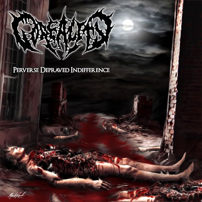
so is that the finished artwork
|
|
|
His signature sticks out like a sore thumb. He wouldn't go for just putting his name inside the insert?
Might as well have just posted a picture of his face on the cover.
It's done well for the most part but it looks too much like final fantasy fanart.
I'm sure the CD will kick ass reguardless though. |
|
|
just saw the updated version, woot woot |
|
|
I'll post it here by the weekend. |
|
|
WAY better without the smudge lines. |
|
|
Wow! huge improvement better than i expected, Dude is kickin ass all the sudden. Ill be picking this one up for sure! keep up the improvements mark!
fu |
|
|
thank christ the smudges are gone, haha. definitely made a world of difference. |
|
|
everything is done but the vox.... |
|
|
Dan said 2 more Sundays!
Doubt this will be out by CIM if it isn't sent to press by mid-June.
|
 
| [default homepage]
|
[print][ | 10:06:44pm Apr 19,2024
load time 0.02846 secs/19 queries] | [search] | [refresh page] |
|